Stop making your users design your product
How to design customizable product experiences without breaking everything

Henry Dan
Jan 12, 2026

I used to think users should get to control their interfaces.
Can't decide between two layouts? Let users customize it. Different users want different data? Customization. Every time our team hit a hard decision, customization felt like the diplomatic solution.
Then I saw what happened to products that took this too far.
They became Frankenstein's monsters.
Every customer had a totally unique setup. Onboarding was a nightmare because there were no best practices to teach. Updates broke existing workflows. The product was impossible to redesign because you couldn't change anything without breaking someone's custom configuration.
Customization isn't inherently bad. But thoughtless customization will destroy your product.
Why you can't say yes to everything
Without a driving force behind your decisions, you get a patchwork mess of a product:
It's hard to make changes because you're afraid of breaking existing customer workflows
You can't redesign without breaking things, so you add bloat every time you add something new
It's hard to onboard new customers because you can't provide guidance on best practices
It's hard to train your team because you have to explain all these weird niche decisions
And it's hard to build design systems if every customer request adds bespoke requirements
A huge pillar of great design is the ability to segment your users into core personas so you can generalize their needs and make holistic design decisions. But if every single customer is a totally unique persona then it's impossible to make empathetic design decisions at scale.
What are users actually asking
When you get a request, peel back the onion. Not just what they requested, but why.
For example, a customer comes to you and says, "I need to reorder the columns on all my tables." At a glance it sounds straightforward, but that can mean many things:
Do they constantly need to see different data and want to save each of those views?
Is their important data on the 15th column and they have to scroll to see it every time?
Is this a problem other customers are having too?
Getting answers helps you aim at a smaller target. Do you need to modify one view, change the table component as a whole, or do you genuinely need customizability?
If you blindly add column editing, now you run the risk of every customer changing and breaking their layouts. And maybe column editing helps your power users, but new users with the same problem don't understand how to edit and save their layouts.
In the end you might solve the problem for one person but have to solve it again for everybody else, and risk breaking their specific setup when you eventually redesign.
Three questions to ask before you start
1. Have we built something like this before?
I was designing an analytics dashboard, and the request was: "Can we add a new page for monitoring team activity?"
So I asked questions to break it down: this is supplementary monitoring information to the main dashboard. It felt like the notifications panel or messaging panel we'd already designed: a side-peek drawer for viewing specific data.
From design and dev perspectives, we can use the drawer component we already have. For users, it's a familiar interaction pattern. For the product, it's reusable across other pages.
And if later on we decide it needs a full-page view, we could add an "expand" interaction to the drawer component as a whole and provide that option everywhere that it's used. This way the same effort equates to more value across the product.
In the end by reusing an existing component we were able to meet the customer request without adding any extra overhead for our team, and benefit all of our users at the same time.
2. Is this a unitasker?
If you've watched Good Eats, you know that a unitasker that only does one thing and just takes up drawer space is a problem. But one tool that does many things earns its space.
Some examples of unitasker features I've seen before:
Exporting to a legacy format from the 90s used by one customer
Custom notifications for the CEO to monitor the team's activity
A custom dashboard based on one customer's Excel workflows
Custom user roles for 100 different team members
Physical addresses required for account signup (so leadership knew which offices their team members were at)
If you add one thing that solves one problem for one user, you get a cluttered product that doesn't scale. Ask yourself:
Am I only solving one problem here?
Could this benefit other customers?
Could we build something cool on top of this?
If the answers are no it's probably a unitasker, and a red flag worth diving into.
It's also worth noting that in some cases the best solution to avoid a unitasker actually is customization, but we'll come back to that.
3. What's the actual problem?
A customer said, "I want to change the color of every task to any color I want."
Do they really need billions of hex codes? Or do they just have internal meaning behind green tasks and blue tasks? Or is the core problem just "I want to identify tasks from each other"?
We talked it through: colors were paired with specific task types from the post-it notes they used to use for task tracking, and now it was baked in to their processes.
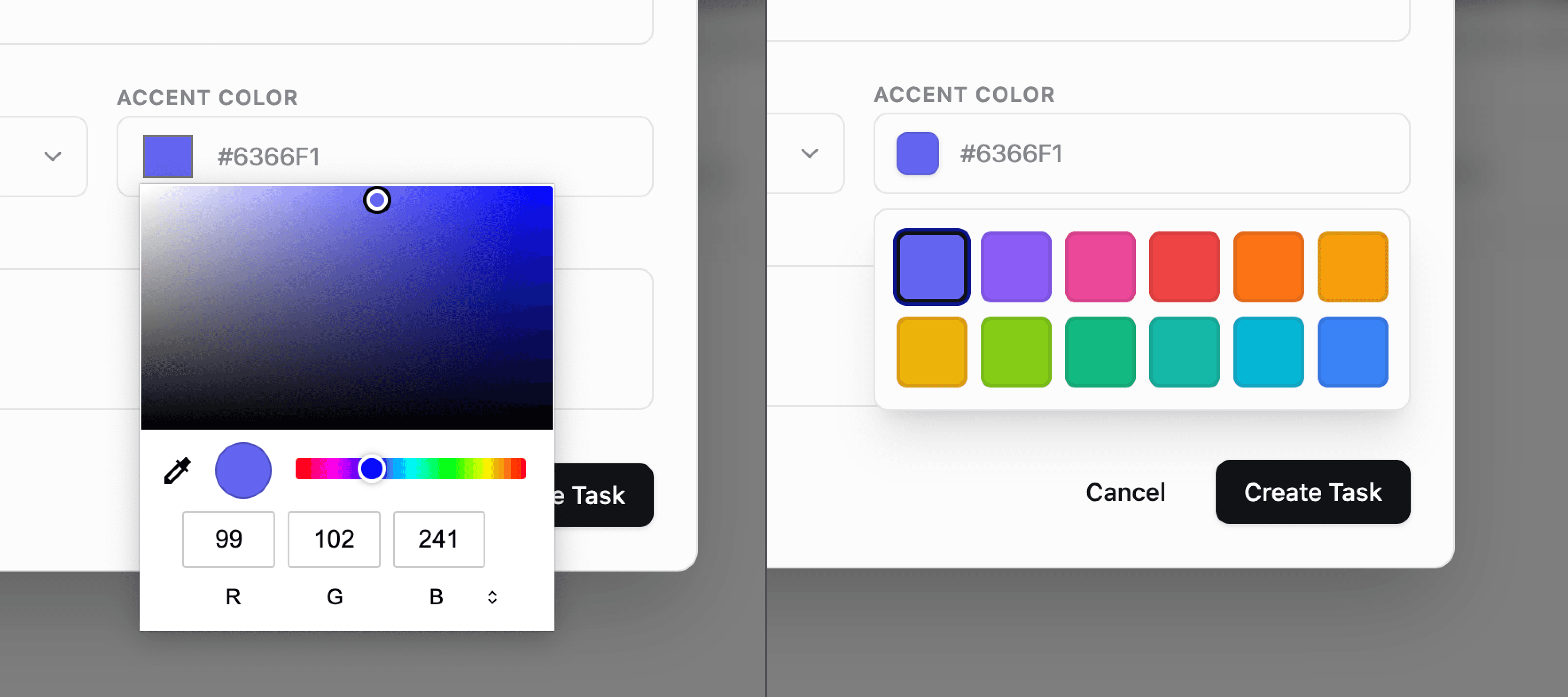
The solution: a selectable list of 12 preset colors. It covered everything they needed. It was accessible for new users who didn't have to pick random colors. And it opened us up to add task color as a filter option, or group tasks by color, or set automations.
By making sure we were aiming at the right target we were able to make a decision influenced by customer input without having to make a decision solely driven by customer input.
Fixing customizable UIs
Yes, customization can be a crutch. But sometimes you really do need to let users customize their experience.
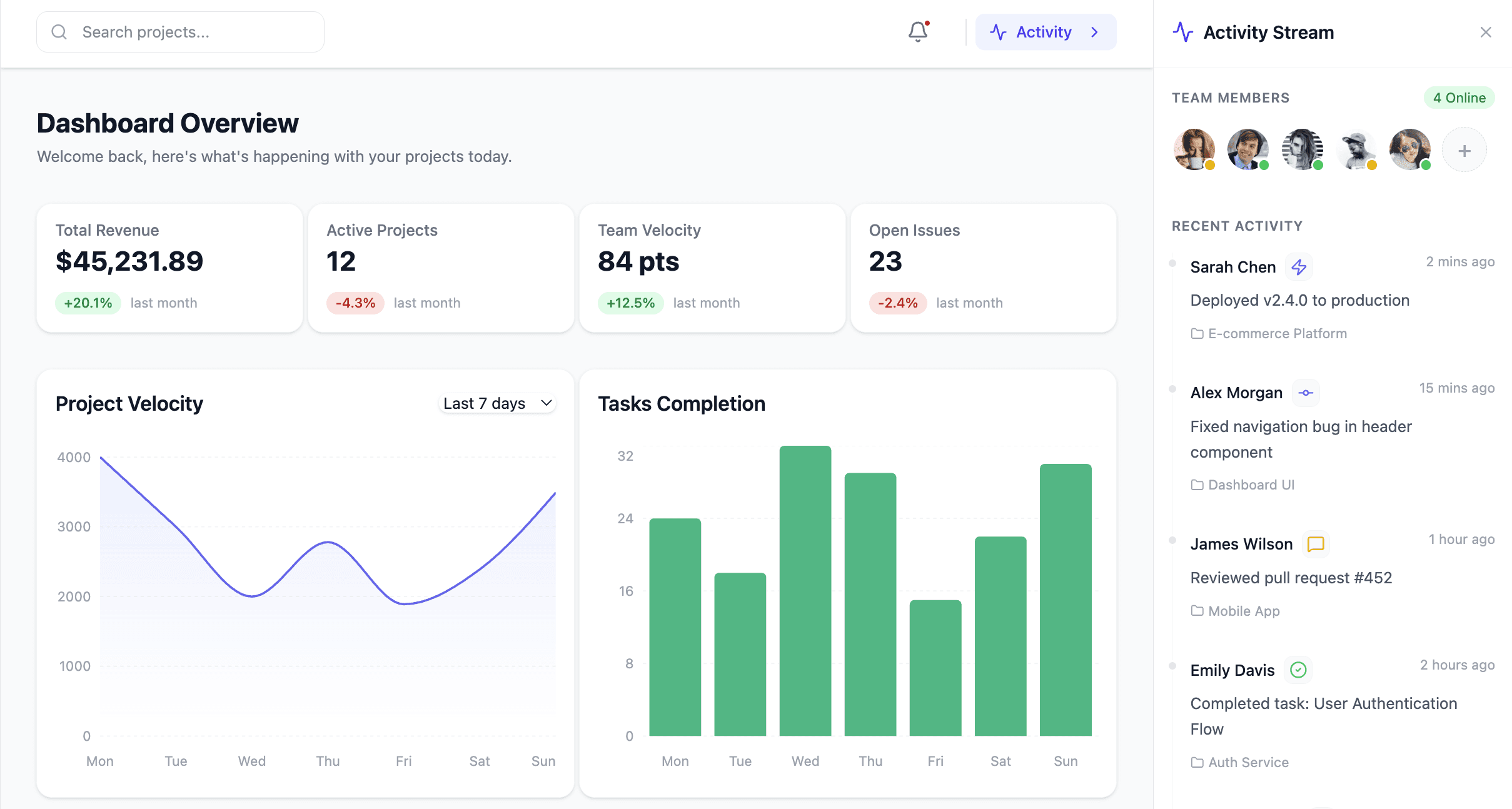
The more important your product is to customers' work, the more it overlaps with processes and preferences unique to each person. Look at a product like Notion, whose whole value proposition is that it works because you can use it for almost anything.
So sometimes answer isn't eliminating customization, but rather designing it with intention.
Think of well designed customization not as giving users free rein to make and break their experience, but as thoughtfully designing Lego bricks that are useful and intuitive for them to assemble.
How to design for customization
Let's say you need to design a customizable dashboard. On one end of the spectrum you could just rebuild Excel and let anybody build anything. On the other end, you could just design the dashboard yourself and have it be static. Both have some obvious drawbacks.
So, how do we meet in the middle? What if we boil the dashboard down to the basics. What makes up a dashboard?
Widgets that can be different sizes
Each widget has a data source with optional filters
Each widget has a display option (list, bar graph, pie chart)
Display options have sizing constraints
Widgets live on a 12-column grid and snap to it
This first-principles thinking opens things up. The same system could power a financial dashboard, team productivity dashboard, or project dashboard. It gives you control as a designer. For example maybe a pie chart has a smaller minimum width, but a horizontal bar chart can't be smaller than 4 columns wide.
And everything I just described is also a really clear mental model that you can explain to your users. Charts have data. They have a display option. They can have filters. That makes it really easy to write documentation, record videos, and teach users how to use it and what the constraints are.
And, as a bonus, if it's easy for you to explain in clear natural language then it's also probably easy for an LLM to understand. So now your clear mental model can be used as instructions for AI to generate dashboards.
Practical tips for designers
So as designers, what action can we actually take to solve this problem?
If you're talking to customers, it's a matter of hearing their problems at face value, but then taking their solutions with a grain of salt. If you're getting handed requirements, interrogate them.
Build up the muscle to recognize warning signs when you're asked to work on:
Something extremely niche
A unitasker
A duplication of something that exists
A dead-end feature that can't be improved
Something that could be useful for more customers with a small change
You may get pushback. That's okay. If you end up having to design a unitasker for now, that's ok.
But know that you can come back later to make improvements. And if you can communicate how making these improvements will make the product more scalable you'll be able to get leadership and decision makers on your side.
So put in the effort to design the experience of customization, rather than turning users loose and asking them to be designers. Ask what their problems are. Listen intently, and you can use that information to make scalable design decisions so your users don't have to.
Subscribe for more articles like this
Stop making your users design your product
How to design customizable product experiences without breaking everything
Henry Dan
Jan 12, 2026
I used to think users should get to control their interfaces.
Can't decide between two layouts? Let users customize it. Different users want different data? Customization. Every time our team hit a hard decision, customization felt like the diplomatic solution.
Then I saw what happened to products that took this too far.
They became Frankenstein's monsters.
Every customer had a totally unique setup. Onboarding was a nightmare because there were no best practices to teach. Updates broke existing workflows. The product was impossible to redesign because you couldn't change anything without breaking someone's custom configuration.
Customization isn't inherently bad. But thoughtless customization will destroy your product.
Why you can't say yes to everything
Without a driving force behind your decisions, you get a patchwork mess of a product:
It's hard to make changes because you're afraid of breaking existing customer workflows
You can't redesign without breaking things, so you add bloat every time you add something new
It's hard to onboard new customers because you can't provide guidance on best practices
It's hard to train your team because you have to explain all these weird niche decisions
And it's hard to build design systems if every customer request adds bespoke requirements
A huge pillar of great design is the ability to segment your users into core personas so you can generalize their needs and make holistic design decisions. But if every single customer is a totally unique persona then it's impossible to make empathetic design decisions at scale.
What are users actually asking
When you get a request, peel back the onion. Not just what they requested, but why.
For example, a customer comes to you and says, "I need to reorder the columns on all my tables." At a glance it sounds straightforward, but that can mean many things:
Do they constantly need to see different data and want to save each of those views?
Is their important data on the 15th column and they have to scroll to see it every time?
Is this a problem other customers are having too?
Getting answers helps you aim at a smaller target. Do you need to modify one view, change the table component as a whole, or do you genuinely need customizability?
If you blindly add column editing, now you run the risk of every customer changing and breaking their layouts. And maybe column editing helps your power users, but new users with the same problem don't understand how to edit and save their layouts.
In the end you might solve the problem for one person but have to solve it again for everybody else, and risk breaking their specific setup when you eventually redesign.
Three questions to ask before you start
1. Have we built something like this before?
I was designing an analytics dashboard, and the request was: "Can we add a new page for monitoring team activity?"
So I asked questions to break it down: this is supplementary monitoring information to the main dashboard. It felt like the notifications panel or messaging panel we'd already designed: a side-peek drawer for viewing specific data.
From design and dev perspectives, we can use the drawer component we already have. For users, it's a familiar interaction pattern. For the product, it's reusable across other pages.
And if later on we decide it needs a full-page view, we could add an "expand" interaction to the drawer component as a whole and provide that option everywhere that it's used. This way the same effort equates to more value across the product.
In the end by reusing an existing component we were able to meet the customer request without adding any extra overhead for our team, and benefit all of our users at the same time.
2. Is this a unitasker?
If you've watched Good Eats, you know that a unitasker that only does one thing and just takes up drawer space is a problem. But one tool that does many things earns its space.
Some examples of unitasker features I've seen before:
Exporting to a legacy format from the 90s used by one customer
Custom notifications for the CEO to monitor the team's activity
A custom dashboard based on one customer's Excel workflows
Custom user roles for 100 different team members
Physical addresses required for account signup (so leadership knew which offices their team members were at)
If you add one thing that solves one problem for one user, you get a cluttered product that doesn't scale. Ask yourself:
Am I only solving one problem here?
Could this benefit other customers?
Could we build something cool on top of this?
If the answers are no it's probably a unitasker, and a red flag worth diving into.
It's also worth noting that in some cases the best solution to avoid a unitasker actually is customization, but we'll come back to that.
3. What's the actual problem?
A customer said, "I want to change the color of every task to any color I want."
Do they really need billions of hex codes? Or do they just have internal meaning behind green tasks and blue tasks? Or is the core problem just "I want to identify tasks from each other"?
We talked it through: colors were paired with specific task types from the post-it notes they used to use for task tracking, and now it was baked in to their processes.
The solution: a selectable list of 12 preset colors. It covered everything they needed. It was accessible for new users who didn't have to pick random colors. And it opened us up to add task color as a filter option, or group tasks by color, or set automations.
By making sure we were aiming at the right target we were able to make a decision influenced by customer input without having to make a decision solely driven by customer input.
Fixing customizable UIs
Yes, customization can be a crutch. But sometimes you really do need to let users customize their experience.
The more important your product is to customers' work, the more it overlaps with processes and preferences unique to each person. Look at a product like Notion, whose whole value proposition is that it works because you can use it for almost anything.
So sometimes answer isn't eliminating customization, but rather designing it with intention.
Think of well designed customization not as giving users free rein to make and break their experience, but as thoughtfully designing Lego bricks that are useful and intuitive for them to assemble.
How to design for customization
Let's say you need to design a customizable dashboard. On one end of the spectrum you could just rebuild Excel and let anybody build anything. On the other end, you could just design the dashboard yourself and have it be static. Both have some obvious drawbacks.
So, how do we meet in the middle? What if we boil the dashboard down to the basics. What makes up a dashboard?
Widgets that can be different sizes
Each widget has a data source with optional filters
Each widget has a display option (list, bar graph, pie chart)
Display options have sizing constraints
Widgets live on a 12-column grid and snap to it
This first-principles thinking opens things up. The same system could power a financial dashboard, team productivity dashboard, or project dashboard. It gives you control as a designer. For example maybe a pie chart has a smaller minimum width, but a horizontal bar chart can't be smaller than 4 columns wide.
And everything I just described is also a really clear mental model that you can explain to your users. Charts have data. They have a display option. They can have filters. That makes it really easy to write documentation, record videos, and teach users how to use it and what the constraints are.
And, as a bonus, if it's easy for you to explain in clear natural language then it's also probably easy for an LLM to understand. So now your clear mental model can be used as instructions for AI to generate dashboards.
Practical tips for designers
So as designers, what action can we actually take to solve this problem?
If you're talking to customers, it's a matter of hearing their problems at face value, but then taking their solutions with a grain of salt. If you're getting handed requirements, interrogate them.
Build up the muscle to recognize warning signs when you're asked to work on:
Something extremely niche
A unitasker
A duplication of something that exists
A dead-end feature that can't be improved
Something that could be useful for more customers with a small change
You may get pushback. That's okay. If you end up having to design a unitasker for now, that's ok.
But know that you can come back later to make improvements. And if you can communicate how making these improvements will make the product more scalable you'll be able to get leadership and decision makers on your side.
So put in the effort to design the experience of customization, rather than turning users loose and asking them to be designers. Ask what their problems are. Listen intently, and you can use that information to make scalable design decisions so your users don't have to.
Subscribe for more articles like this